Dear Investor,
You may have already noticed: We have revised and expanded the comparison function.
This was done at the request of many members of the Seasonax community who shared their wishes with us. Thank you for your suggestions!
The new comparison function
The comparison function allows you to draw additional lines on the seasonal chart. This lets you, for example, compare the seasonal performance of a stock with that of its corresponding index in a single chart.
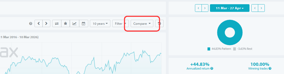
It is very easy to use. You can now access the comparison function directly to the right above the seasonal chart.
Calling the comparison function
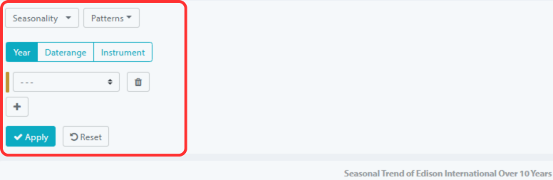
There are three types of comparison: single years, seasonal patterns, and other instruments.
The comparison menu will open and you can perform comparisons in three ways:
1.) Year: This allows you to compare the seasonal pattern with individual years. For example, you can plot the price trend for the current year.
2.) Area: Here, you can display further seasonal patterns for other time periods. For example, you can compare seasonality over 10 years with that over 25 years.
3.) Instrument: This allows you to compare different instruments. For example, you can compare the seasonal performance of a stock with that of its corresponding index in a chart. In the upper left corner, you select which of these three comparison types you wish to perform.
Using the comparison function
Here’s how to use the new comparison function
a.) First choose what you want to compare: single year , seasonal year range or instrument .
b.) Then select a year or enter an instrument.
c.) If you want to make further comparisons in a chart, use the “+” symbol.
d.) By clicking “Apply,” the lines will be displayed. The result might then look like this, for example, when comparing the S&P 500, the DAX, gold, and the Hang Seng:
Comparison of seasonal performance of the S&P 500, DAX, gold, Hang Seng
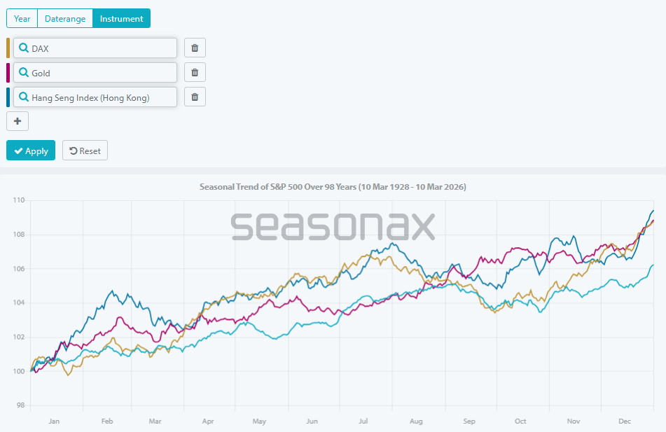
You will now see several color-coded seasonal trend lines displayed in a single chart!
Statistics are now also available for comparisons.
But that’s not all. You can now also compare the statistical indicators in one go.
To do this, select a sample time period with your mouse as usual. The result might then look something like this:
Sample comparison of the S&P 500, DAX, gold, Hang Seng
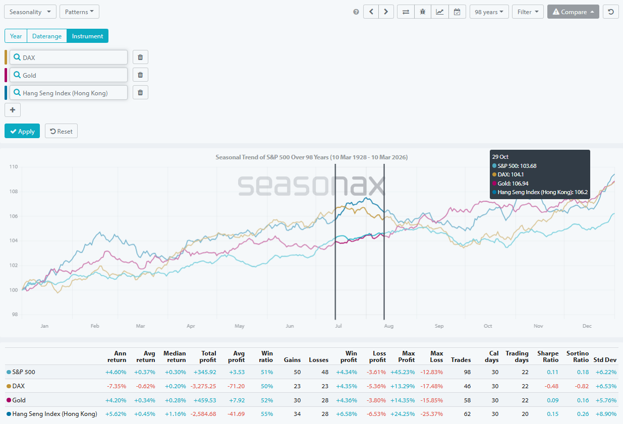
Below the chart you will see the statistical data for all four instruments over the selected period.
So you no longer need to call up the values one after the other.
Instead, you can see the key figures of all selected instruments at a glance!
Seasonax is constantly expanding its range of functions.
I think the new comparison function is very well done.
What do you think? Let us know!
Warm regards,
Dimitri Speck
Founder and Chief Analyst of Seasonax
P.S. My thanks go to all the employees at Seasonax. They have implemented this feature wonderfully!
P.P.S. You can also apply a filter first, for example, the midterm election year filter. If you then select the comparison feature, the filter remains applied to the seasonal pattern, while the comparison values themselves remain unfiltered. This allows you to view the seasonal path of an instrument with and without the filter in a single chart.